Which is the better description of the line graph: A or B?
Why?
|
|
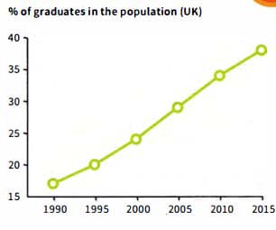
| The graph shows the percentage of graduates in the UK population between 1990 and 2015. In 1990 17% of the population of the UK were graduates. This rose to 20% in 1995 and 24% in 2000. In 2005, it went up to 29%, in 2010 to 34% and up to 38% in 2015. |
| The graph shows an upward trend in the % of graduates in the population between 1990 and 2015. The percentage rose gradually throughout the period. It increased by about 3 to 5% every five years, for example between 1990 and 1995 it increased from 17 to 20%. |
