This marking criterion covers how the answer is organised,how well the information is linked together and whether it makes sense to the reader. Key aspects of this include:
- paragraphing
- the correct and varied use of linkers (words or phrases) to introduce points in a clear way and to connect ideas logically, allowing the reader to follow it easily
- use of referencing words and phrases, such as pronouns, to avoid repetition.
|
05. Read this feedback from a teacher on coherence and cohesion in the candidate's answer in exercise 4. Choose linkers from the box to replace the inappropriate highlighted linkers (1-4). Can you think of any other alternatives for these linkers?
|
|
The order of information is appropriate and you have divided it into paragraphs. However there is some inappropriate use of linkers. For example, in the first paragraph. is 'obviously' the best choice here? It could imply that everyone should know this information.
In the second paragraph. what do you mean with the word 'nevertheless? Do you want to show a contrast?
In the third paragraph, why is it 'surprising' that the 19805 saw a 'huge reduction‘? This implies knowledge from outside the data set. which shouldn't be included in Task 1 answers. Are you saying that you are surprised? what do you mean by 'At last' here in the same paragraph? This implies that you are relieved by this figure.
|
|
|
1. Obviously
2. Nevertheless
3. Surprisingly
4. At last
For example
By the end of the period shown, in 2015,
The clear trend in the figures is that
It is striking that |
|
| You can improve your Coherence and Cohesion score if you can use a variety of discourse markers correctly. For Task 1 questions like these, try making your own lists of discourse markers that you can use, and classify them by their function. Practise using them when you do exam practice questions so that you learn to choose appropriate ones depending on the question. |
|
06. Look at this answer by another candidate about the same table. The coherence and cohesion is much better in this one. Find discourse markers that perform the functions listed on the next page. There may be more than one answer for each function.
|
|
The data shows how many deep coal mines were in operation in the UK at various points in the 100-year period between 1913 and 2015. The overall trend is clearly one of decline. In fact, by the end of the given time frame, deep mines had almost ceased to operate in the UK.
In the early decades of the twentieth century, there were still thousands of coal mines in Britain: to give a specific example, there were 3024 of them still operational in 1913. However, the process of closing down the UK's deep mines had clearly begun: by 1923, the number had fallen to 2607. By the middle of the century, it was apparent that the days of British coal mining were numbered. In 1963, the figure fell below 1,000 for the first time.
One of the most striking features of this table is that the deterioration of Britain’s coal mining industry accelerated even further in the 19805 and was almost complete by the turn of the twenty-first century.
1. To emphasise or exemplify an idea or point that you are making
In fact
to give a specific example
One of the most striking features of this table is
2. To provide an overview of the evident tendencies in the data
3. To show a contrast with previous information
4. To introduce key time periods in the data
|
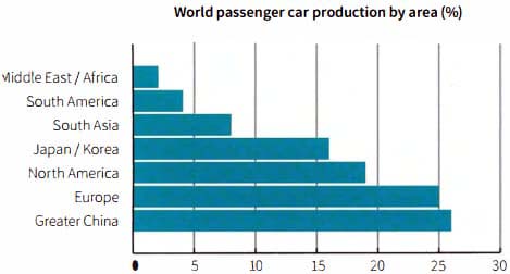
07. Look at this bar chart which shows data on the manufacture of passenger cars in 2015. With a partner, discuss the following questions.
|
|
1. What is the most important information in this chart?
2. Which regions of the data would you focus on to make comparisons?
3. How would you organise your answer based on this data?
|
|
|
08. Now look at a sample answer which summarises and reports the data in exercise 7. Some of the discourse markers have been removed. Fill the gaps with words or phrases from the box.
|
| although Turning next to moving on to respectively By contrast Whereas in terms of What stands out is For the purposes of this data set |
|
|
The bar chart gives the percentage of passenger cars manufactured by different regions of the world. , the world is divided into seven regions, with the total adding up to 100%.
that the regions pf Greater China and Europe lead the way , the manufacture of passenger cars, with 26% and 25% . ,very few cars are produced in the Middle East and Africa: just 2% originate from that area.
the Americas, a sharp contrast can be seen between the Northern and Southern parts of the continent. North America can boast 19% of the world’s passenger car production, South America manufactures just 4% of this type of vehicle.
Finally, Japan and Korea, they are just two countries rather than a whole region, they account for a sizeable proportion of the total, at 16%.
|
09. Find words and phrases from the box in exercise 8 which match these functions.
|
|
1. Showing contrast:
2. Introducing a new point/idea/section:
3. To emphasise or exemplify an idea or point that you are making:
4. To introduce a statement which clarifies the data:
5. To indicate that some information is in the same order as connected information mentioned in a previous statement:
|
10. These are extracts from the sample answers in exercises 6 and 8. What information does each underlined word or phrase allow the writer to avoid repeating?
|
|
1. The overall trend is clearly of decline.
2. the 100-year period between 1913 and 2015 ... by the end of
3. ... there were still thousands of coal mines in Britain: to give a specific example, there were 3024 .
4. the process of closing down the UK's deep mines had clearly begun: by 1923, had fallen to 2607.
5. North America can boast 19% of the world's passenger car production, South America manufactures just 4% of .
|
